Code
# 基本運算
2 + 3
[1] 5Code
10 - 4[1] 6Code
5 * 6[1] 30Code
20 / 4[1] 5Code
2^3 # 次方[1] 8本附錄提供 R 語言的基礎操作,幫助沒有 R 經驗的讀者快速上手。如果您已熟悉 R,可以跳過此章節。
# 基本運算
2 + 3[1] 510 - 4[1] 65 * 6[1] 3020 / 4[1] 52^3 # 次方[1] 8# 使用 <- 或 = 指派變數
x <- 5
y = 10
# 顯示變數
x[1] 5y[1] 10# 使用變數
x + y[1] 15# 建立向量
v1 <- c(1, 2, 3, 4, 5)
v2 <- 1:10
# 序列
seq(0, 1, by = 0.1) [1] 0.0 0.1 0.2 0.3 0.4 0.5 0.6 0.7 0.8 0.9 1.0seq(0, 1, length.out = 11) [1] 0.0 0.1 0.2 0.3 0.4 0.5 0.6 0.7 0.8 0.9 1.0# 安裝本書使用的主要套件
install.packages("ggplot2")
install.packages("dplyr")
install.packages("tidyr")
install.packages("patchwork")
install.packages("plotly")
install.packages("latex2exp")
install.packages("showtext")
# 或一次安裝全部
install.packages(c("ggplot2", "dplyr", "tidyr", "patchwork", "plotly", "latex2exp", "showtext"))# ggplot2 和 patchwork 已在 setup 中載入
library(dplyr)
library(tidyr)ggplot2 使用「圖層」概念建構圖形:
# 準備資料
x <- seq(-3, 3, by = 0.1)
y <- dnorm(x)  # 標準常態分布
df <- data.frame(x, y)

# 基本折線圖
ggplot(df, aes(x = x, y = y)) +
  geom_line()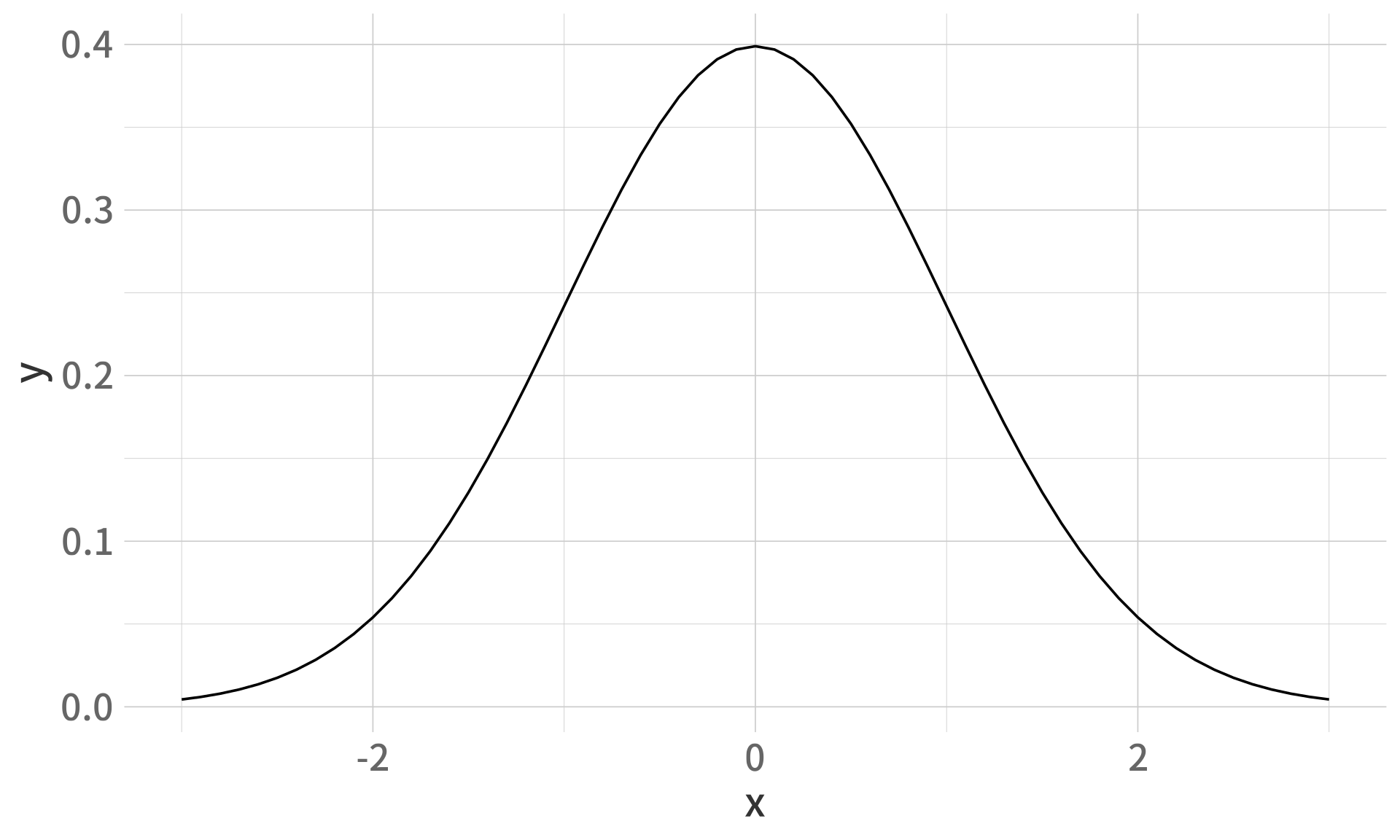
ggplot(df, aes(x, y)) +
  geom_line(color = "#2E86AB", linewidth = 1.2) +
  geom_area(fill = "#2E86AB", alpha = 0.3) +
  labs(
    title = "標準常態分布",
    subtitle = "μ = 0, σ = 1",
    x = "x",
    y = "機率密度 f(x)"
  ) +
  theme_minimal(base_size = 14)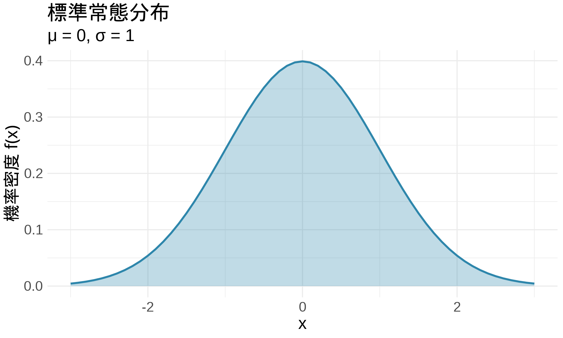
# 散點圖
ggplot(df, aes(x, y)) +
  geom_point()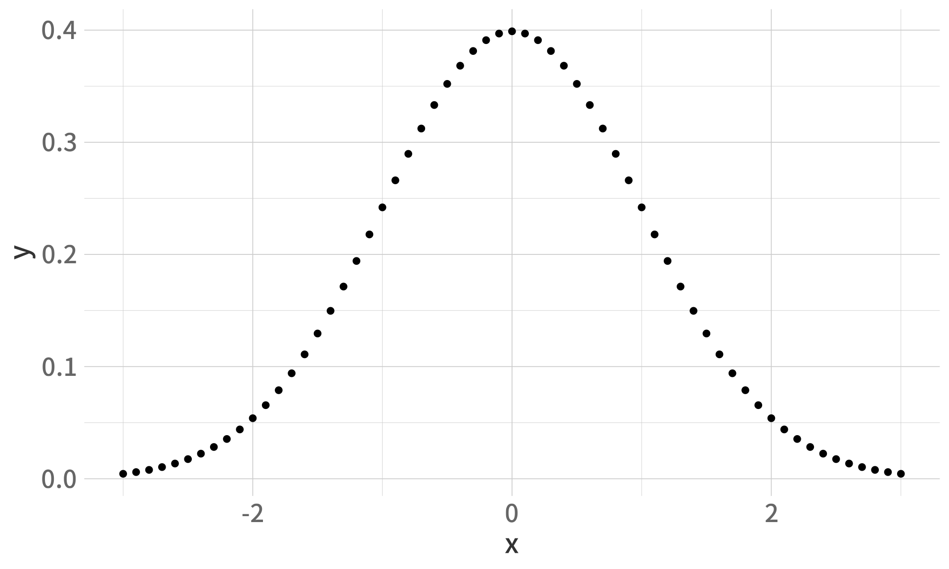
# 長條圖(使用新資料)
data <- data.frame(
  category = c("A", "B", "C", "D"),
  value = c(23, 45, 12, 34)
)

ggplot(data, aes(x = category, y = value)) +
  geom_col(fill = "#2E86AB")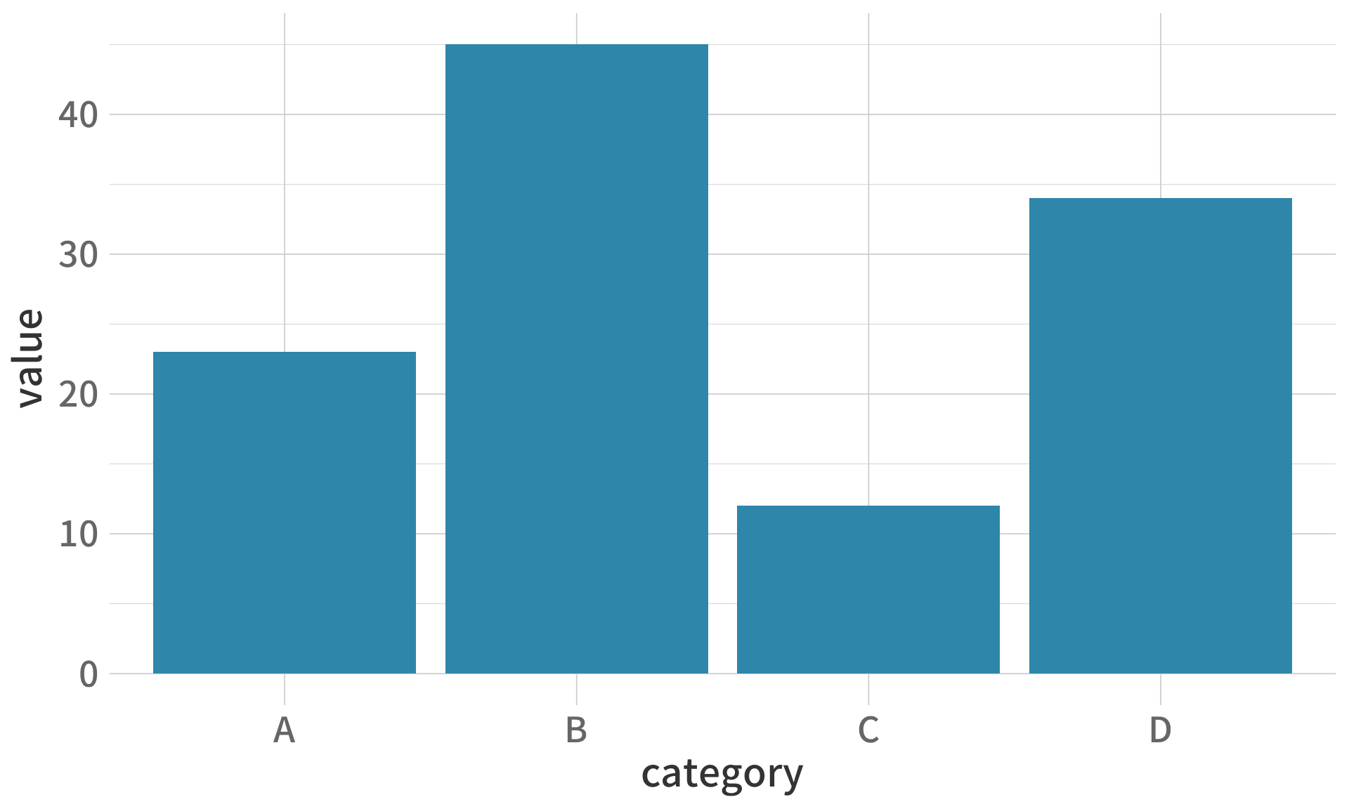
# 直方圖
set.seed(42)
random_data <- rnorm(1000)

ggplot(data.frame(x = random_data), aes(x)) +
  geom_histogram(fill = "#2E86AB", color = "white", bins = 30)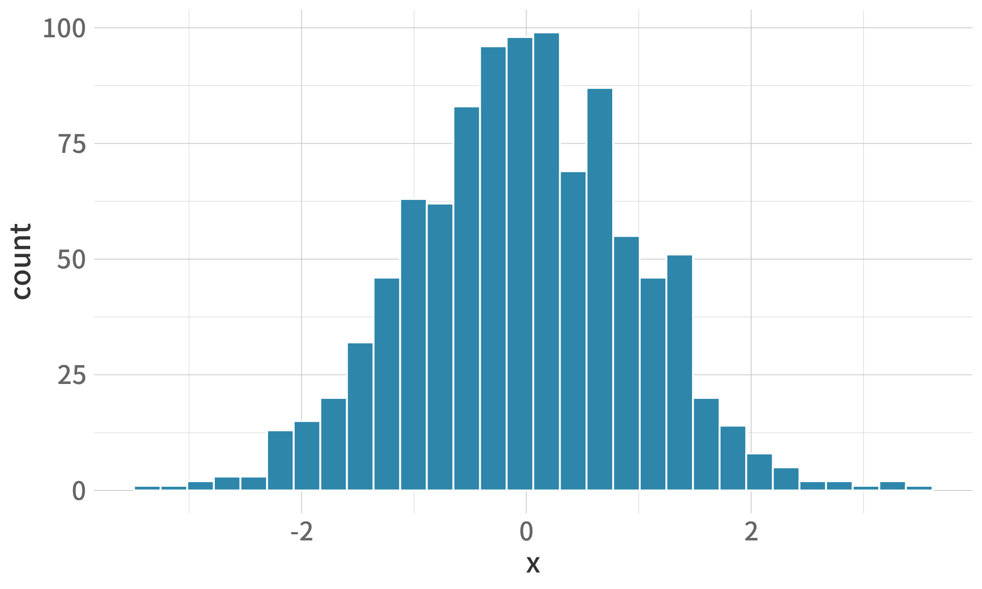
ggplot(df, aes(x, y)) +
  geom_line(color = "#2E86AB", linewidth = 1) +
  # 垂直線
  geom_vline(xintercept = 0, linetype = "dashed", color = "gray50") +
  # 水平線
  geom_hline(yintercept = 0.2, linetype = "dotted", color = "gray50") +
  # 文字註解
  annotate("text", x = 0, y = 0.42, label = "μ = 0", size = 5) +
  # 點
  geom_point(aes(x = 0, y = dnorm(0)), color = "#E94F37", size = 4) +
  theme_minimal()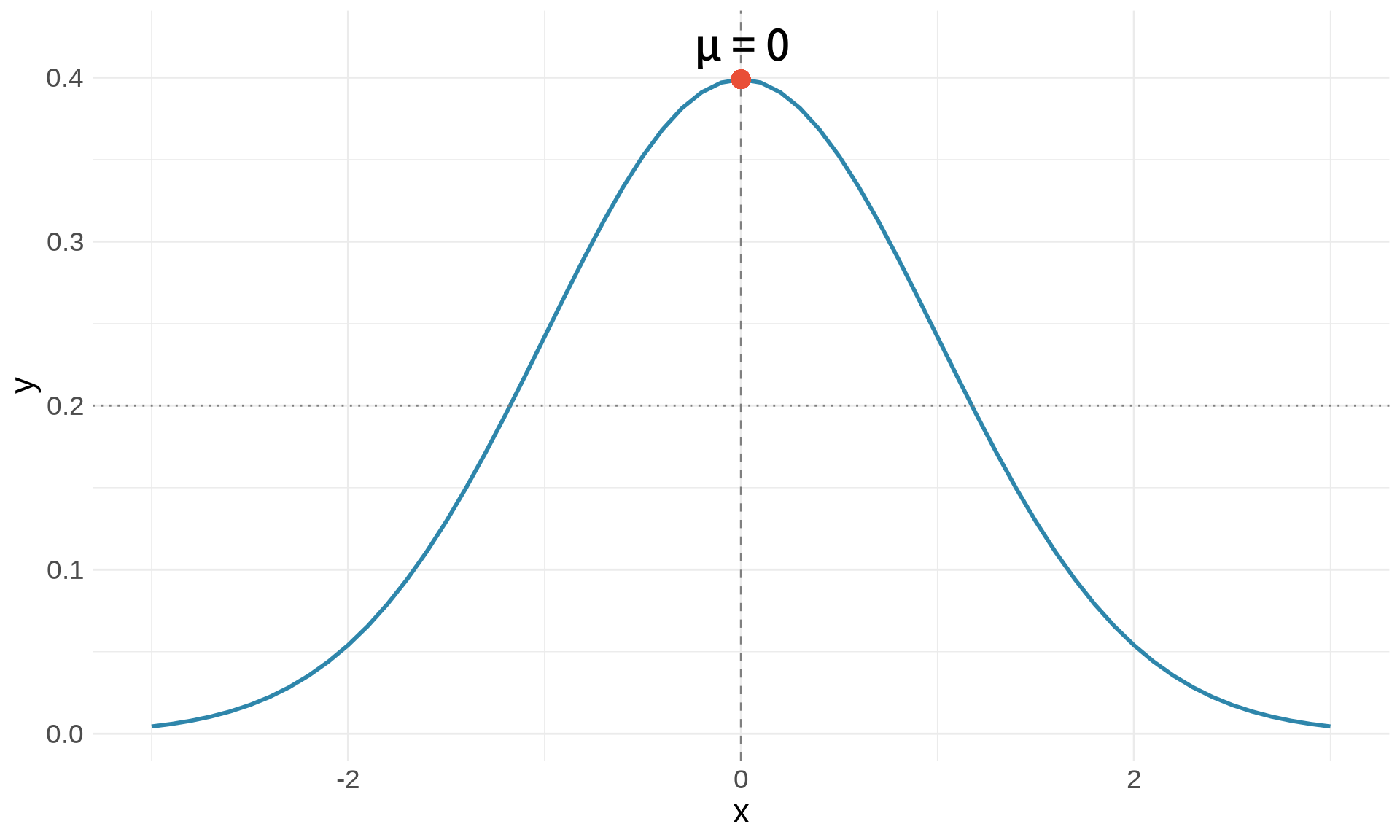
# 建立示範資料
patients <- data.frame(
  id = 1:5,
  age = c(45, 62, 38, 71, 54),
  sbp = c(120, 145, 118, 160, 135),
  treatment = c("A", "B", "A", "B", "A")
)

# 檢視資料
patients
id age sbp treatment
1 1 45 120 A
2 2 62 145 B
3 3 38 118 A
4 4 71 160 B
5 5 54 135 A# 篩選年齡 > 50 的病患
patients %>%
filter(age > 50) id age sbp treatment
1 2 62 145 B
2 4 71 160 B
3 5 54 135 A# 篩選收縮壓 >= 140
patients %>%
filter(sbp >= 140) id age sbp treatment
1 2 62 145 B
2 4 71 160 B# 只保留 id 和 age
patients %>%
select(id, age) id age
1 1 45
2 2 62
3 3 38
4 4 71
5 5 54# 排除 treatment
patients %>%
select(-treatment) id age sbp
1 1 45 120
2 2 62 145
3 3 38 118
4 4 71 160
5 5 54 135# 計算高血壓分類
patients %>%
mutate(
hypertension = ifelse(sbp >= 140, "是", "否")
) id age sbp treatment hypertension
1 1 45 120 A 否
2 2 62 145 B 是
3 3 38 118 A 否
4 4 71 160 B 是
5 5 54 135 A 否# 依年齡排序
patients %>%
arrange(age) id age sbp treatment
1 3 38 118 A
2 1 45 120 A
3 5 54 135 A
4 2 62 145 B
5 4 71 160 B# 依收縮壓遞減排序
patients %>%
arrange(desc(sbp)) id age sbp treatment
1 4 71 160 B
2 2 62 145 B
3 5 54 135 A
4 1 45 120 A
5 3 38 118 A# 組合多個操作
patients %>%
filter(age > 40) %>%
mutate(age_group = ifelse(age >= 60, "老年", "中年")) %>%
select(id, age, age_group, sbp) %>%
arrange(desc(sbp)) id age age_group sbp
1 4 71 老年 160
2 2 62 老年 145
3 5 54 中年 135
4 1 45 中年 120# 常態分布
dnorm(0) # 密度函數 (PDF)[1] 0.3989423pnorm(0) # 累積分布函數 (CDF)[1] 0.5qnorm(0.5) # 分位數函數[1] 0rnorm(10) # 隨機抽樣 [1] 2.3250585 0.5241222 0.9707334 0.3769734 -0.9959334 -0.5974829
[7] 0.1652514 -2.9284772 -0.8479142 0.7985845# 指數函數與對數
exp(1) # e^1[1] 2.718282log(10) # 自然對數 ln(10)[1] 2.302585log10(100) # 以 10 為底[1] 2# 三角函數
sin(pi/2)[1] 1cos(0)[1] 1x <- 1:5
# 向量化運算
x^2[1] 1 4 9 16 25sqrt(x)[1] 1.000000 1.414214 1.732051 2.000000 2.236068log(x)[1] 0.0000000 0.6931472 1.0986123 1.3862944 1.6094379# 統計量
mean(x)[1] 3sd(x)[1] 1.581139var(x)[1] 2.5sum(x)[1] 15# 建立兩個圖
p1 <- ggplot(df, aes(x, y)) +
geom_line(color = "#2E86AB") +
labs(title = "圖 A") +
theme_minimal()
p2 <- ggplot(df, aes(x, y)) +
geom_area(fill = "#E94F37", alpha = 0.5) +
labs(title = "圖 B") +
theme_minimal()
# 水平排列
p1 | p2
# 垂直排列
p1 / p2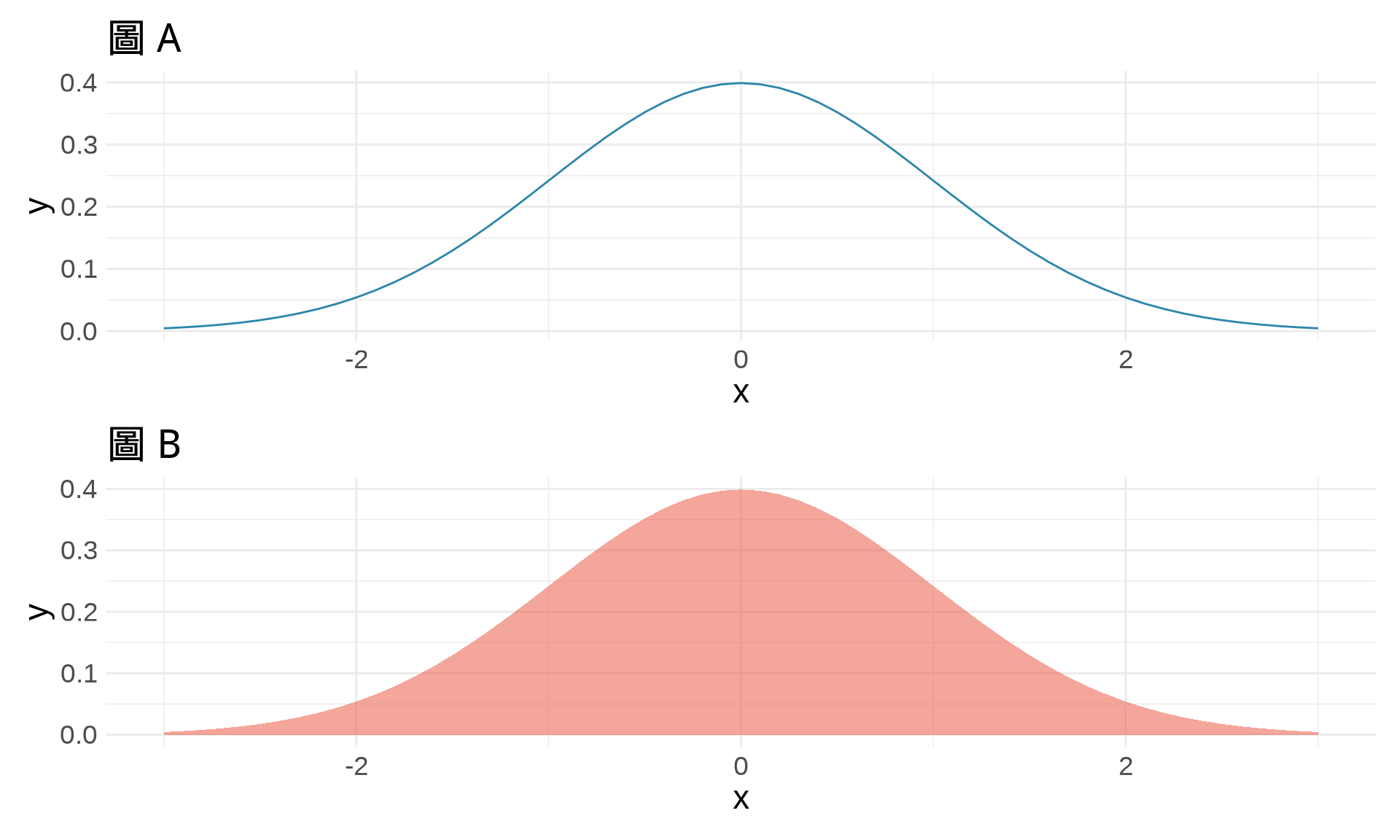
# 複雜排列
p1 | (p2 / p1)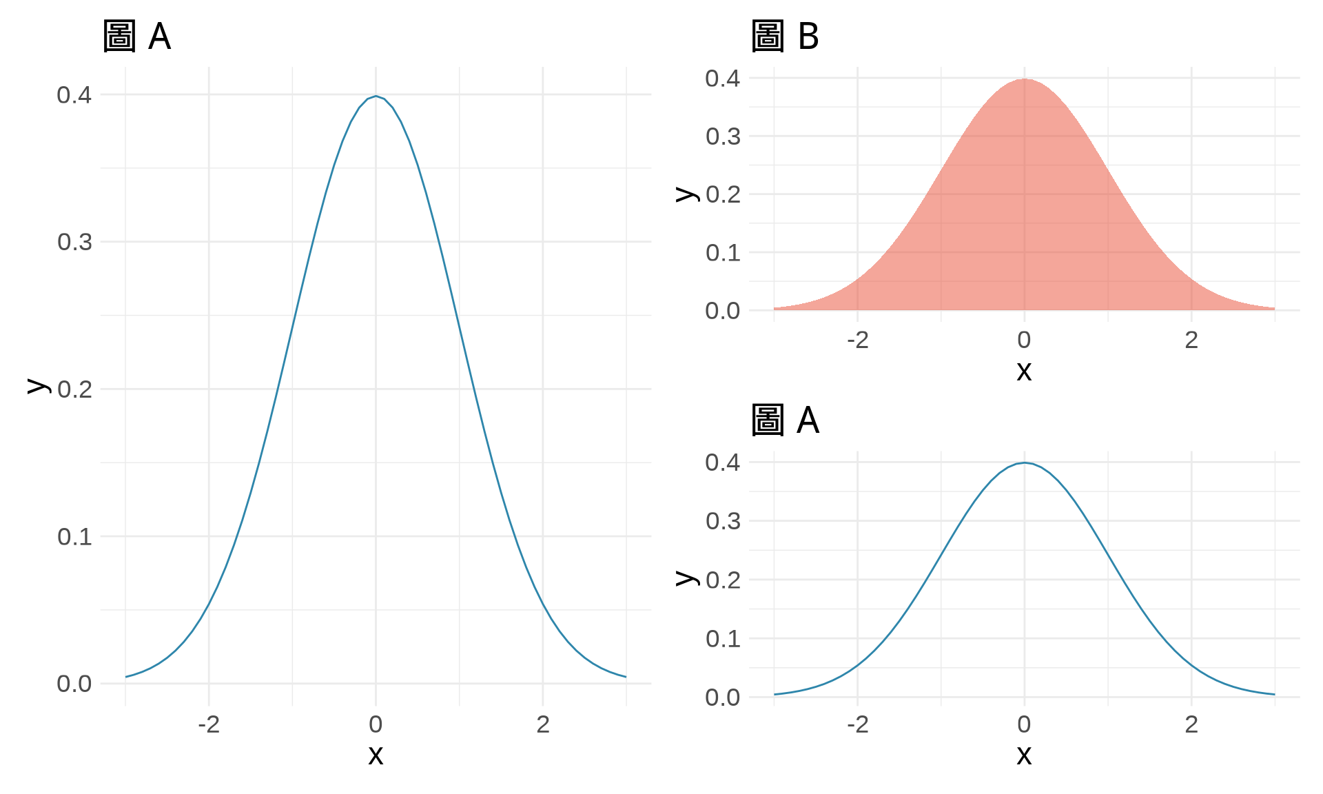
# 查看函數說明
?mean
?ggplot

# 搜尋關鍵字
??regression

# 查看套件說明
help(package = "ggplot2")# 查看當前工作目錄
getwd()
# 設定工作目錄
setwd("/path/to/your/folder")# 使用 ggsave
p <- ggplot(df, aes(x, y)) +
geom_line()
ggsave("my_plot.png", plot = p, width = 8, height = 6, dpi = 300)# 確保結果可重現
set.seed(42)
rnorm(5)[1] 1.3709584 -0.5646982 0.3631284 0.6328626 0.4042683set.seed(42)
rnorm(5) # 產生相同的隨機數[1] 1.3709584 -0.5646982 0.3631284 0.6328626 0.4042683