library(ggplot2)

# 讀取資料
patient_data <- read.csv("patient_data.csv")

# 畫基本盒狀圖(字型已由 _common.R 全域設定)
ggplot(patient_data, aes(x = treatment, y = los)) +
  geom_boxplot()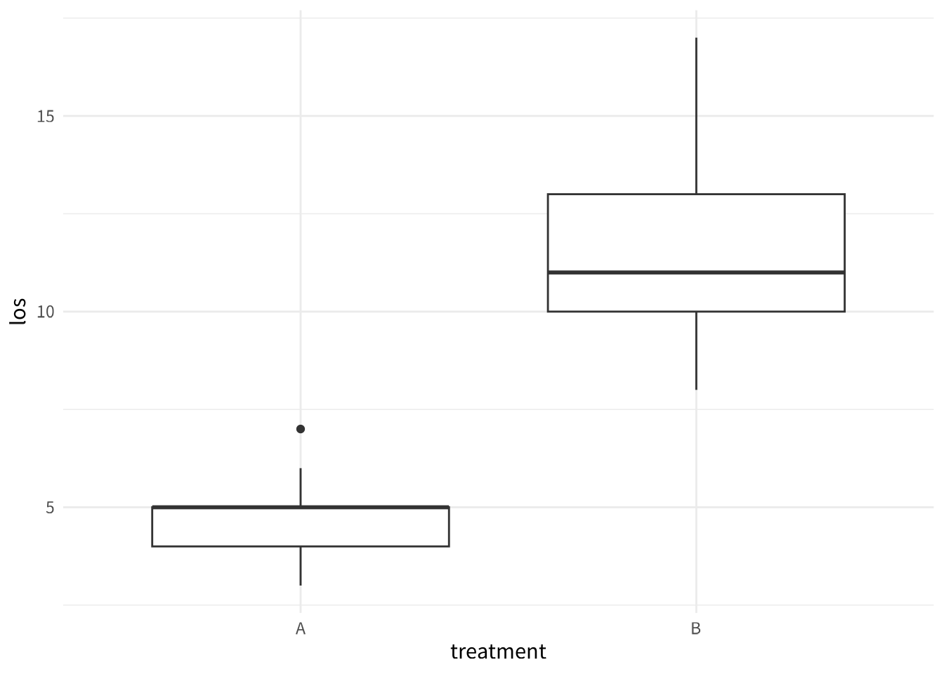
本部分預計時間:40 分鐘
在第三部分,你已經學會用 gtsummary 做出 Table 1。現在我們要用 ggplot2 畫出論文等級的圖表。
我有資料框
patient_data(欄位:treatment A/B、age、gender M/F、los 住院天數)。請用 ggplot2 和 ggsci 幫我一次完成:
- 畫一個盒狀圖比較兩組 los,使用 JAMA 配色,加上標題「兩組治療的住院天數比較」,中文軸標籤
- 在盒狀圖上疊加 jitter 資料點
- 畫一個性別分佈長條圖、一個 age vs los 散佈圖(含趨勢線)、一個 los 直方圖
- 用 patchwork 把以上四張圖組合成一張大圖
- 把組合圖存成 PNG(300 dpi, 12×8 inch)和 SVG
給我一個從
read.csv()到ggsave()一次跑完的完整 script,加上中文註解。
📋 複製這段話,貼給 AI:
我有一個資料框
patient_data,裡面有 treatment(A 或 B 兩組)和 los(住院天數)。請用 ggplot2 畫一個盒狀圖,比較兩組的住院天數分佈。
library(ggplot2)
# 讀取資料
patient_data <- read.csv("patient_data.csv")
# 畫基本盒狀圖(字型已由 _common.R 全域設定)
ggplot(patient_data, aes(x = treatment, y = los)) +
geom_boxplot()
📋 複製這段話,貼給 AI:
請幫我美化這個盒狀圖:
- 加上標題「兩組治療的住院天數比較」
- X 軸標籤改成「治療組別」,Y 軸改成「住院天數(天)」
- 用 Noto Sans TC(Google Fonts)作為中文字體
- 使用 ggsci 的 JAMA 風格配色
- 不要顯示圖例(因為 X 軸已經說明了)
本專案使用 Google Fonts 的 Noto Sans TC 作為中文字型,透過 sysfonts::font_add_google() 自動下載,無需手動安裝。
其他推薦的美化套件:ggthemr, hrbrthemes, tvthemes, ggthemes, viridis, scico
# 載入 ggsci 套件(提供期刊風格配色)
library(ggsci)

# 畫專業的盒狀圖(使用 JAMA 配色,字型已由 _common.R 全域設定)
ggplot(patient_data, aes(x = treatment, y = los, fill = treatment)) +
  geom_boxplot() +
  scale_fill_jama() +
  labs(
    title = "兩組治療的住院天數比較",
    x = "治療組別",
    y = "住院天數(天)"
  ) +
  theme(legend.position = "none")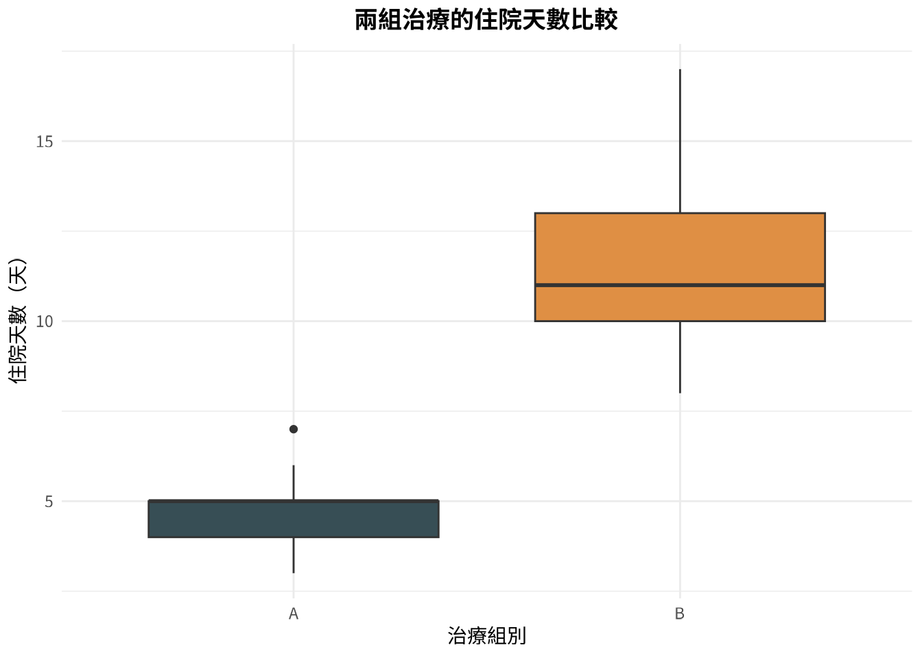
📋 複製這段話,貼給 AI:
我想在盒狀圖上面疊加個別的資料點,讓讀者可以看到實際的分佈。但資料點不要完全重疊,要有一點水平的隨機散開。請修改程式碼。
# 盒狀圖加上資料點
ggplot(patient_data, aes(x = treatment, y = los, fill = treatment)) +
  geom_boxplot(alpha = 0.7) +
  geom_jitter(width = 0.2, alpha = 0.5, size = 2) +
  scale_fill_jama() +
  labs(
    title = "兩組治療的住院天數比較",
    x = "治療組別",
    y = "住院天數(天)"
  ) +
  theme(legend.position = "none")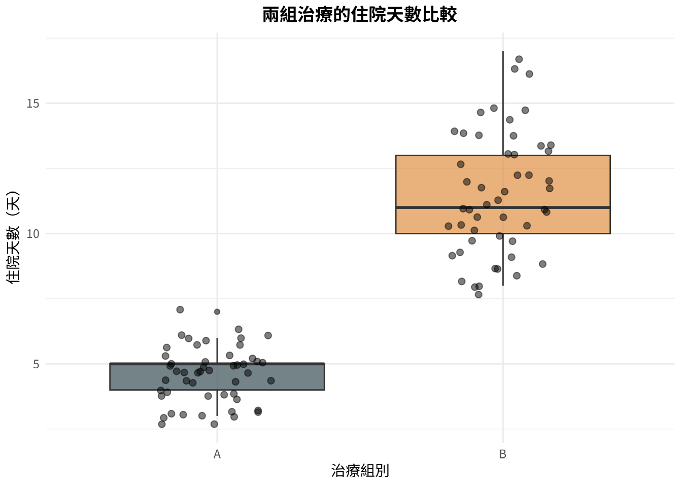
📋 選一個你有興趣的,貼給 AI:
選項 A (長條圖):
請用 ggplot2 畫一個長條圖,顯示 patient_data 裡面 gender 的人數分佈。
選項 B (散佈圖):
請用 ggplot2 畫一個散佈圖,X 軸是 age,Y 軸是 los,我想看年齡和住院天數有沒有關係。
選項 C (直方圖):
請用 ggplot2 畫一個直方圖,顯示 los 的分佈。
可以用 patchwork1 把多張圖整合在一起。其他進階套件:ggdist、ggtext、ggiraph、ggh4x。
# 性別分佈長條圖
ggplot(patient_data, aes(x = gender, fill = gender)) +
  geom_bar() +
  scale_fill_jama() +
  labs(
    title = "性別分佈",
    x = "性別",
    y = "人數"
  ) +
  theme(legend.position = "none")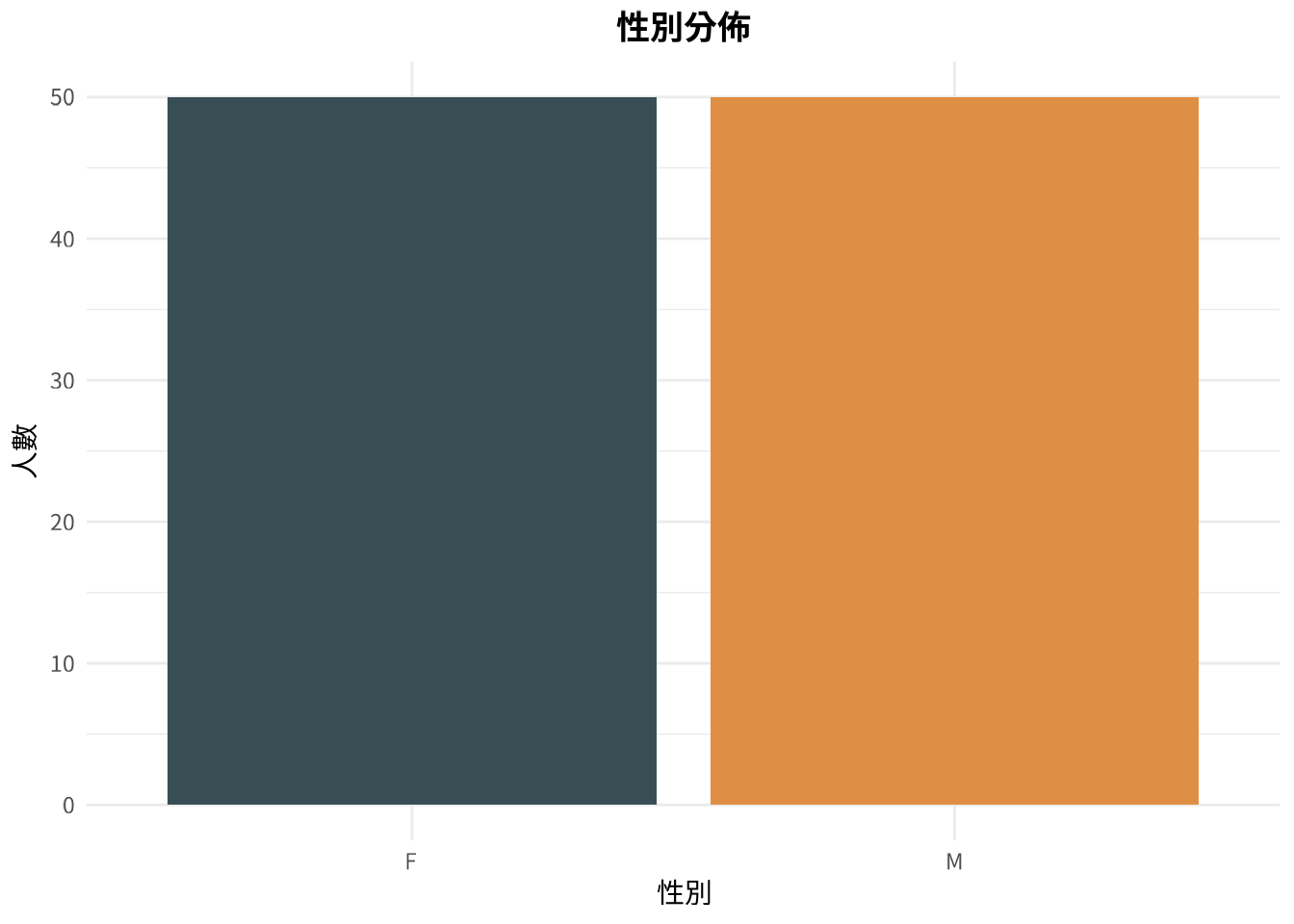
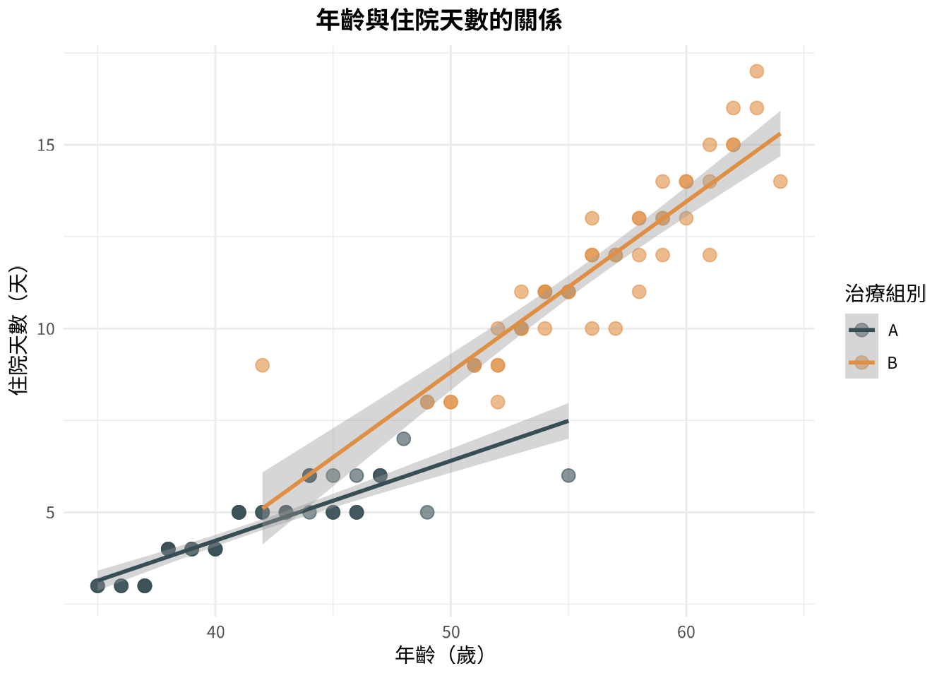
# 年齡與住院天數散佈圖
ggplot(patient_data, aes(x = age, y = los, color = treatment)) +
  geom_point(size = 3, alpha = 0.6) +
  geom_smooth(method = "lm", se = TRUE) +
  scale_color_jama() +
  labs(
    title = "年齡與住院天數的關係",
    x = "年齡(歲)",
    y = "住院天數(天)",
    color = "治療組別"
  )
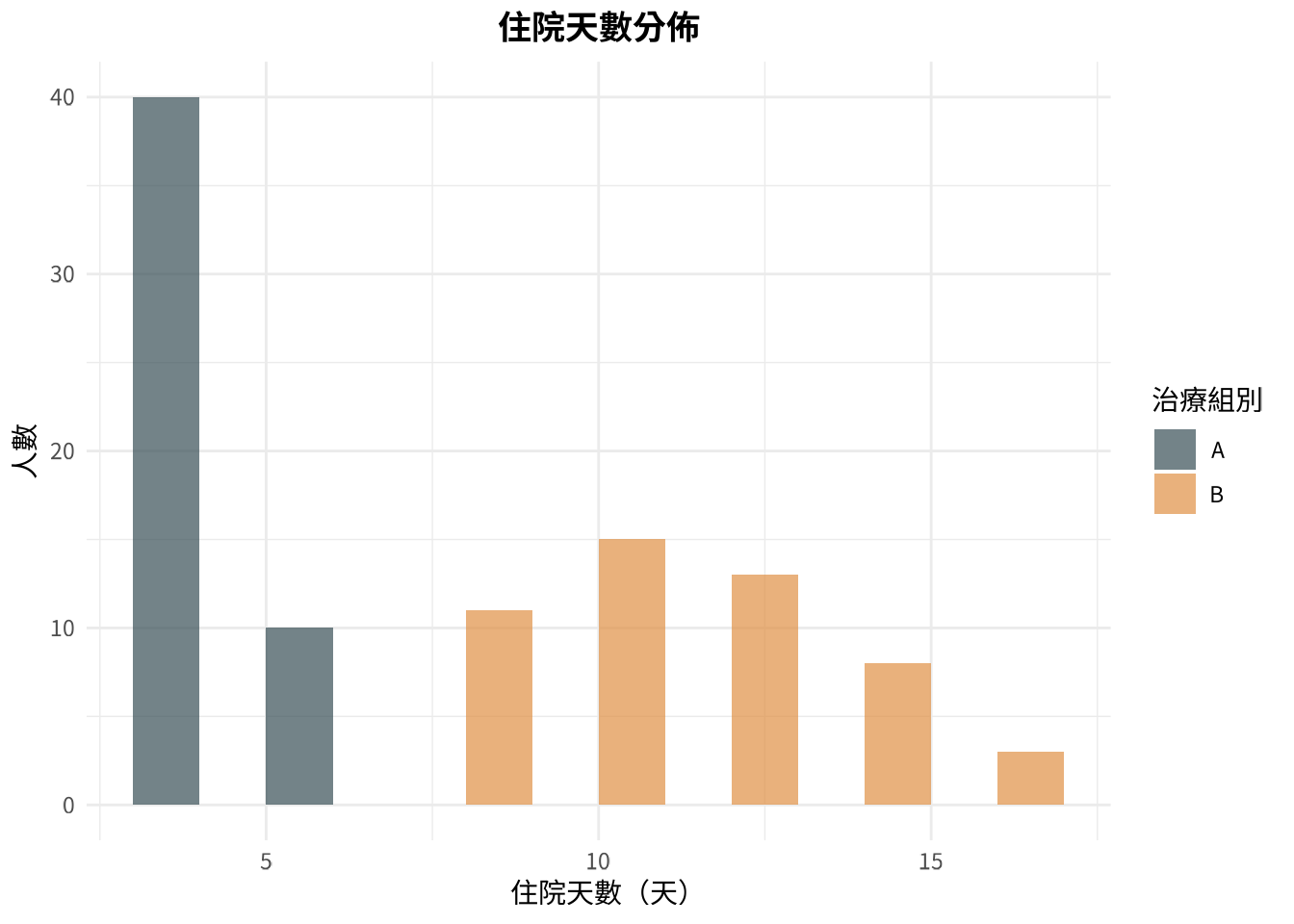
# 住院天數分佈直方圖
ggplot(patient_data, aes(x = los, fill = treatment)) +
  geom_histogram(binwidth = 2, alpha = 0.7, position = "dodge") +
  scale_fill_jama() +
  labs(
    title = "住院天數分佈",
    x = "住院天數(天)",
    y = "人數",
    fill = "治療組別"
  )
library(patchwork)

# 建立三張圖(字型已由 _common.R 全域設定)
p1 <- ggplot(patient_data, aes(x = treatment, y = los, fill = treatment)) +
  geom_boxplot() + scale_fill_jama() +
  theme(legend.position = "none") + labs(title = "A. 盒狀圖")

p2 <- ggplot(patient_data, aes(x = age, y = los, color = treatment)) +
  geom_point() + scale_color_jama() +
  labs(title = "B. 散佈圖")

p3 <- ggplot(patient_data, aes(x = los, fill = treatment)) +
  geom_histogram(binwidth = 2, alpha = 0.7) + scale_fill_jama() +
  labs(title = "C. 直方圖")

# 用 patchwork 組合
(p1 | p2) / p3 + plot_annotation(title = "綜合圖表分析")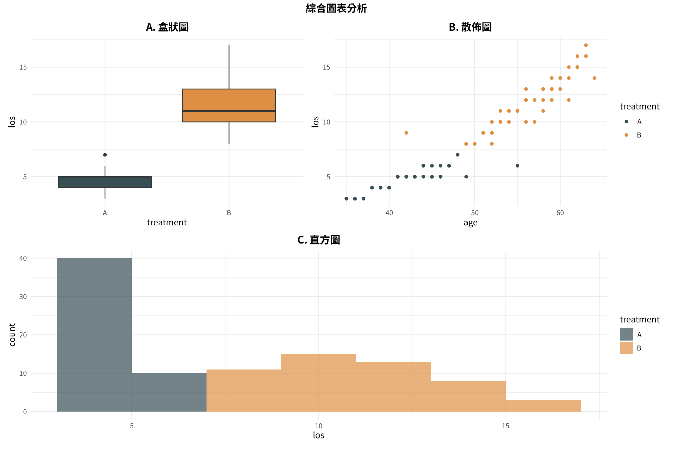
📋 複製這段話,貼給 AI:
我畫好了一張 ggplot2 的圖,想要存成 PNG 檔案,解析度要夠高可以放在論文裡(300 dpi),大小大約是 8×6 英吋。請給我存檔的程式碼。 接著用 svglite 存成 svg 檔(請先下載 svglite)
# 儲存為 PNG 檔(點陣圖,適合網頁和簡報)
ggsave(
  filename = "boxplot_comparison.png",
  width = 8,
  height = 6,
  dpi = 300,
  units = "in"
)

print("圖表已成功儲存為 boxplot_comparison.png")

# 儲存為 SVG 檔(向量圖,適合論文和縮放)
library(svglite)

ggsave(
  filename = "boxplot_comparison.svg",
  width = 8,
  height = 6,
  units = "in",
  device = svglite
)

print("圖表已成功儲存為 boxplot_comparison.svg")